CASE STUDY
A live practice behind a website that had been dark for months.
- Client type
- Implant and general dentistry, two doctors
- Scope
- Full site build · Information architecture · Responsive build
- Year
- 2026
- Status
- Live — acadianadentistry.thecreativezohaib.com
The situation
This one did not start as a redesign. The practice is trading normally, with the same address and phone number on every listing, but acadianadentistry.com returns a CloudFront 403 on every single URL. Apex, www, every path. The last working capture in the Internet Archive is May 2026.
The reason they cannot simply fix it is in the DNS. The site is a subscription product on a vendor platform, served from numbered theme directories, on a host the practice does not control. When it broke, there was nothing for them to log into and repair.
The thinking
A rebuild here is not an aesthetic exercise. It is recovering a business asset that has been off the air long enough for every patient who searched the practice this year to have found an error page instead.
So the first decision was scope rather than style. The original ran to thirty-five pages, twelve of them services, with thirty cases in the smile gallery and around sixty-five questions on the FA’. All of it had to be read back out of the Archive and then judged: what earns a page of its own, what collapses into a section, and what was only ever there because the template had a slot for it.
The design
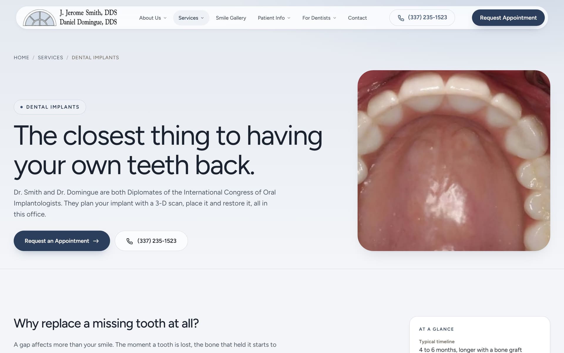
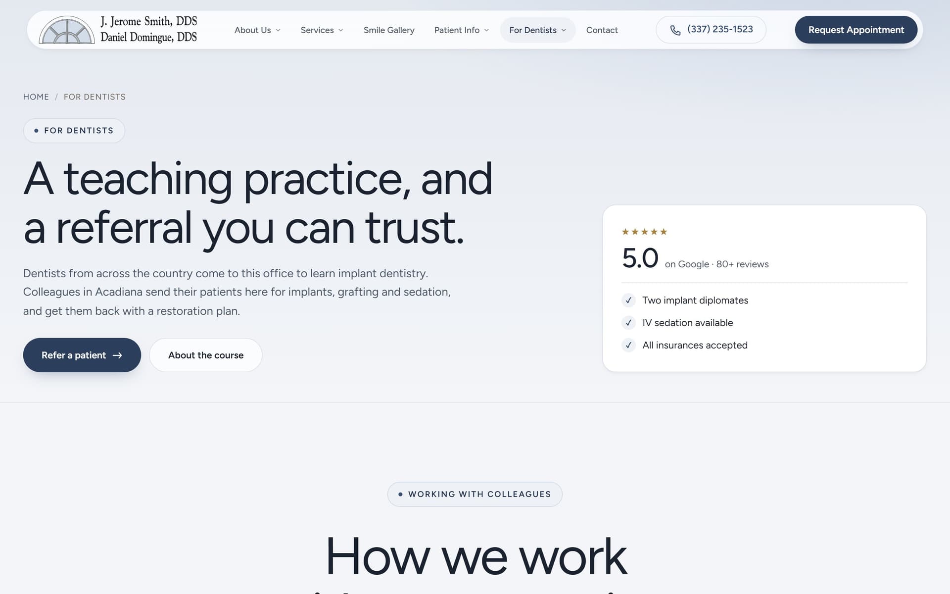
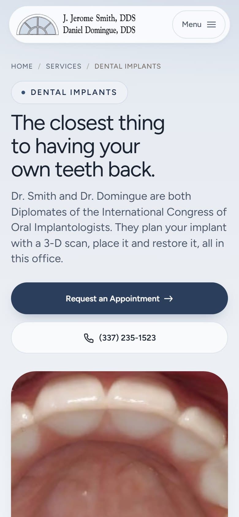
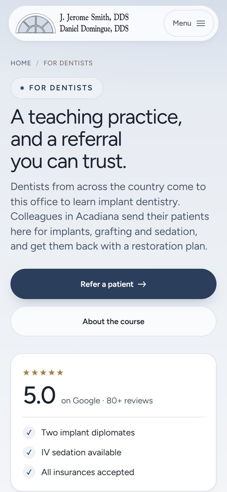
The practice has two audiences and the old site served them from the same undifferentiated menu. Patients arrive researching implants, sedation or a full reconstruction. Referring dentists arrive for something else entirely: where to send a case, and the implant course one of the doctors teaches. Each now has its own route in.
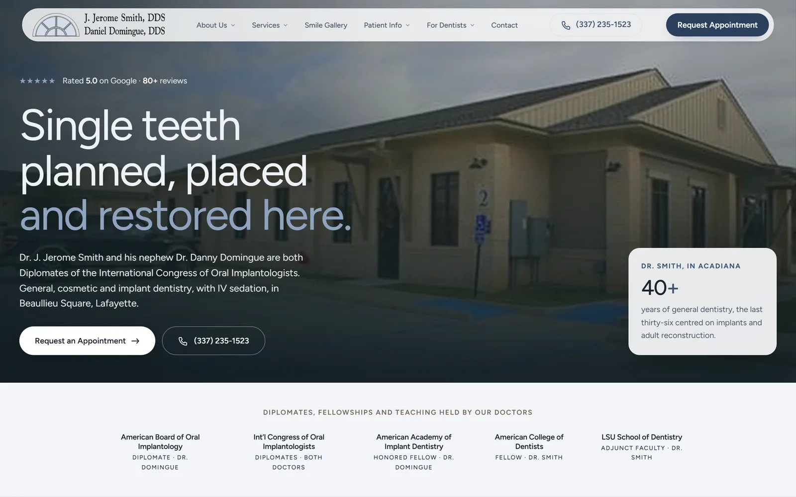
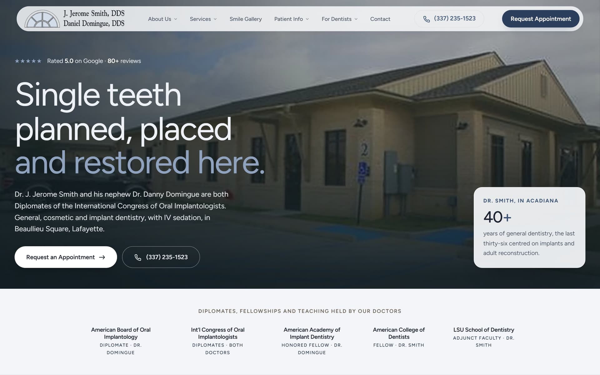
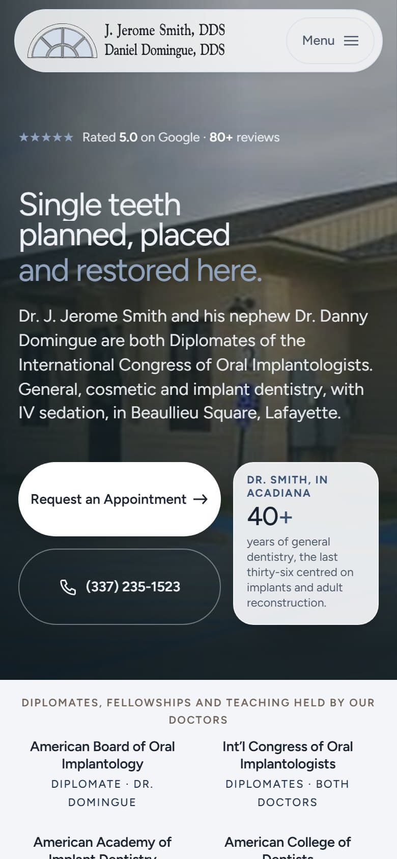
Both doctors are Diplomates of the International Congress of Oral Implantologists, which is the credential that actually bears on the work, so it sits in the first screen rather than four clicks down a bio page. The palette is taken from the practice mark, not from the blue every competitor in the parish already uses.
The build
Thirty-one static pages sharing one navigation tree, so a link added once appears in the bar, the drawer and the footer together. No framework and no build step. Type is one self-hosted variable font file.
Images are WebP sized to their largest rendered box, and each page carries its own title, description and structured data rather than inheriting a template default, which is what the original platform had been doing across all thirty-five of its pages.
WHAT IT DEMONSTRATES
Rebuilding an entire site from an archive crawl when the original is unreachable, deciding what thirty-five template pages should actually collapse into, separating two audiences who were previously served the same menu, and keeping a multi-page static build fast.
THE EVIDENCE
- 89
- 100
- 100
WHAT I’D CHANGE
Measuring this one found a defect across all thirty-one pages: there was no `<main>` element anywhere, so a screen reader had no way past the navigation to the content, and on the homepage the hero was sitting at the top level where it mapped to the banner landmark instead. The numbers above are after fixing it, which took accessibility from 99 to 100 on every run. Performance is a median of 89 and moves between 86 and 93 across runs. SEO reads 69 and stays there, held down entirely by `is-crawlable`, because this preview is noindexed on purpose so it cannot outrank the practice. One run in five also flags `errors-in-console`; that is the analytics request timing out under simulated throttling rather than anything in the page. The honest gap is the enquiry form: it validates properly in the browser but has no backend behind it yet, so connecting it to a real inbox is the first thing that happens at launch rather than something already done.
Independent project — designed and built by me