CASE STUDY
A cosmetic practice whose argument is the photography.
- Client type
- Cosmetic dentistry, single practice
- Scope
- Website design · Front-end development · Responsive build
- Year
- 2026
- Status
- Live — artofdentistryinstitute.thecreativezohaib.com
The situation
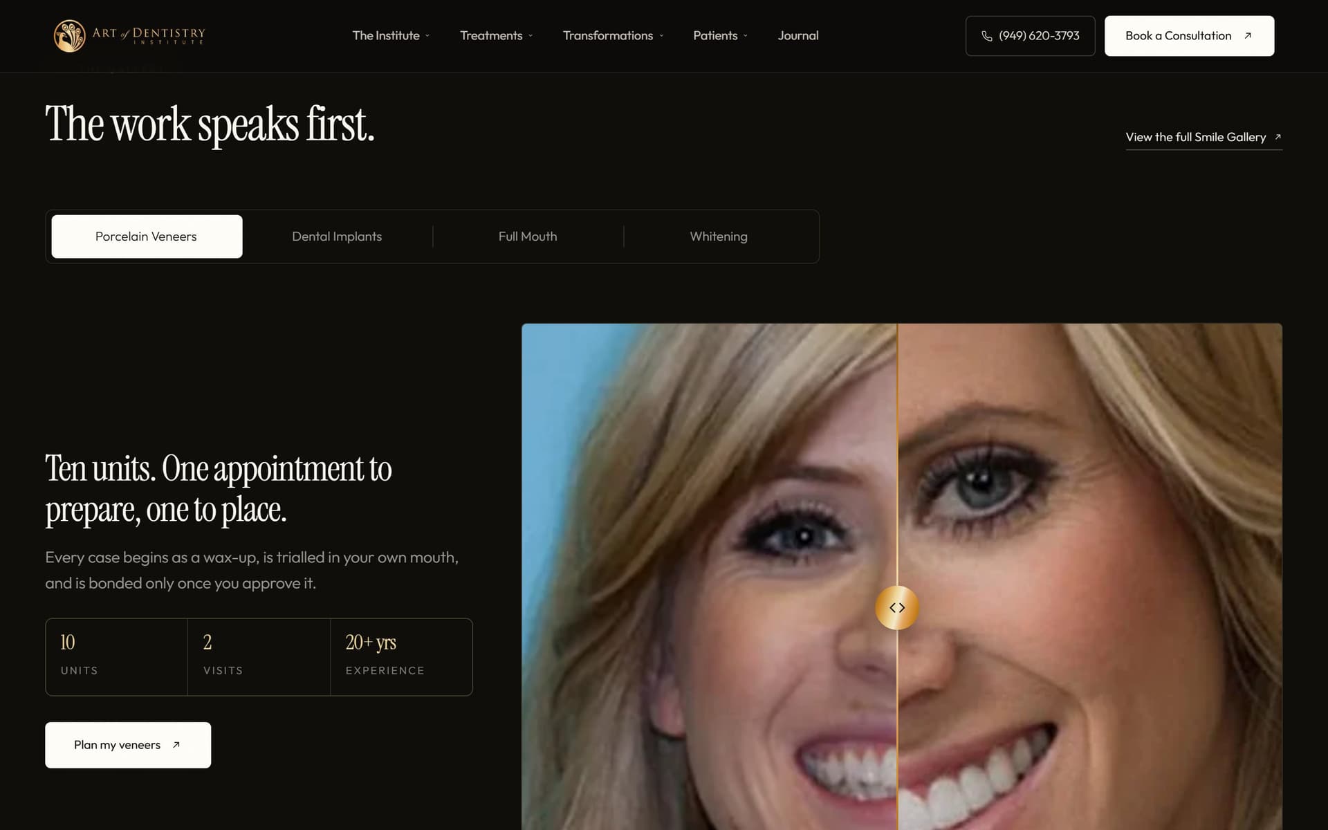
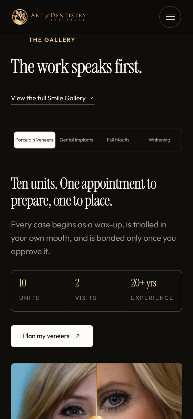
Cosmetic dentistry is the one part of the trade where the patient can actually judge the work. They cannot assess a root canal, but they can look at a smile and decide whether they want that one. That makes the before-and-after library the most persuasive asset the practice owns, and on most cosmetic sites it is buried two clicks down behind a gallery link.
The thinking
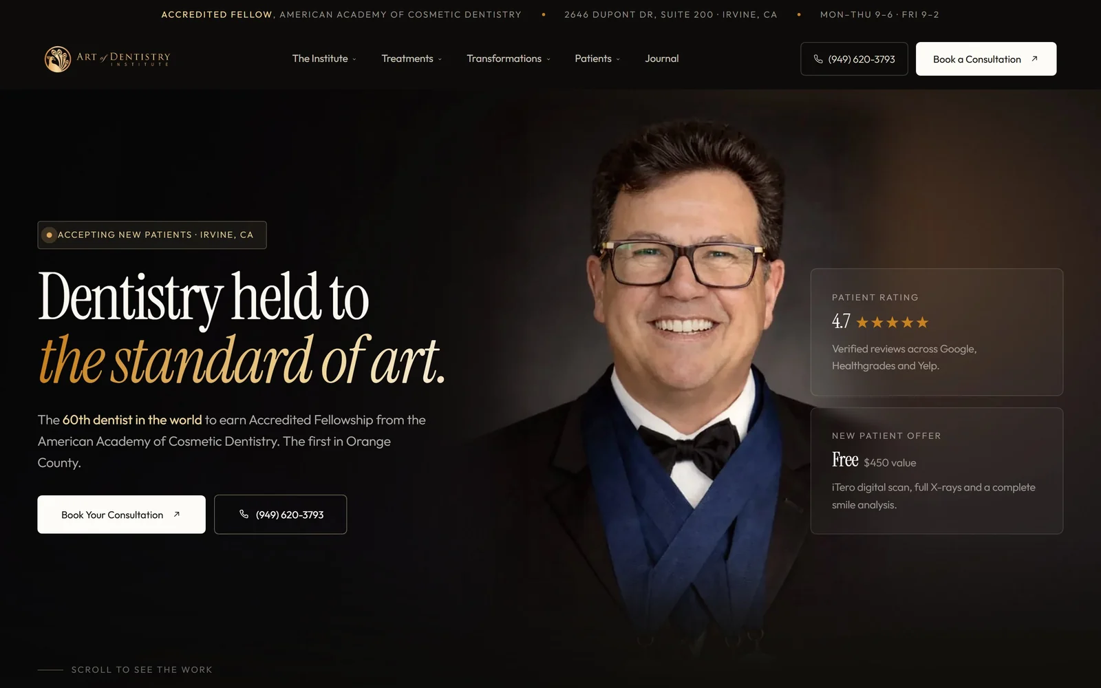
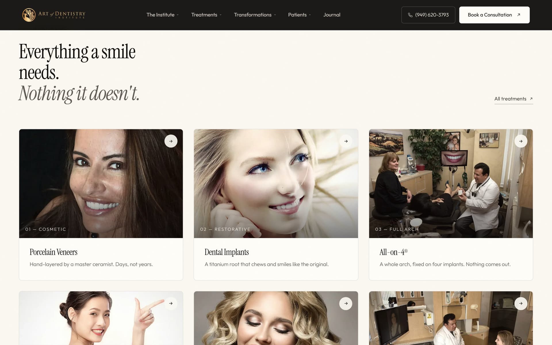
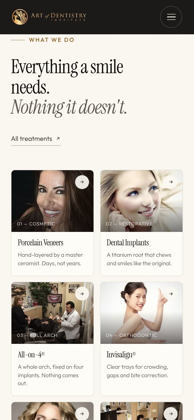
If the photography is the argument, the page should be built as a gallery that happens to have a practice attached, not a brochure that happens to include photographs.
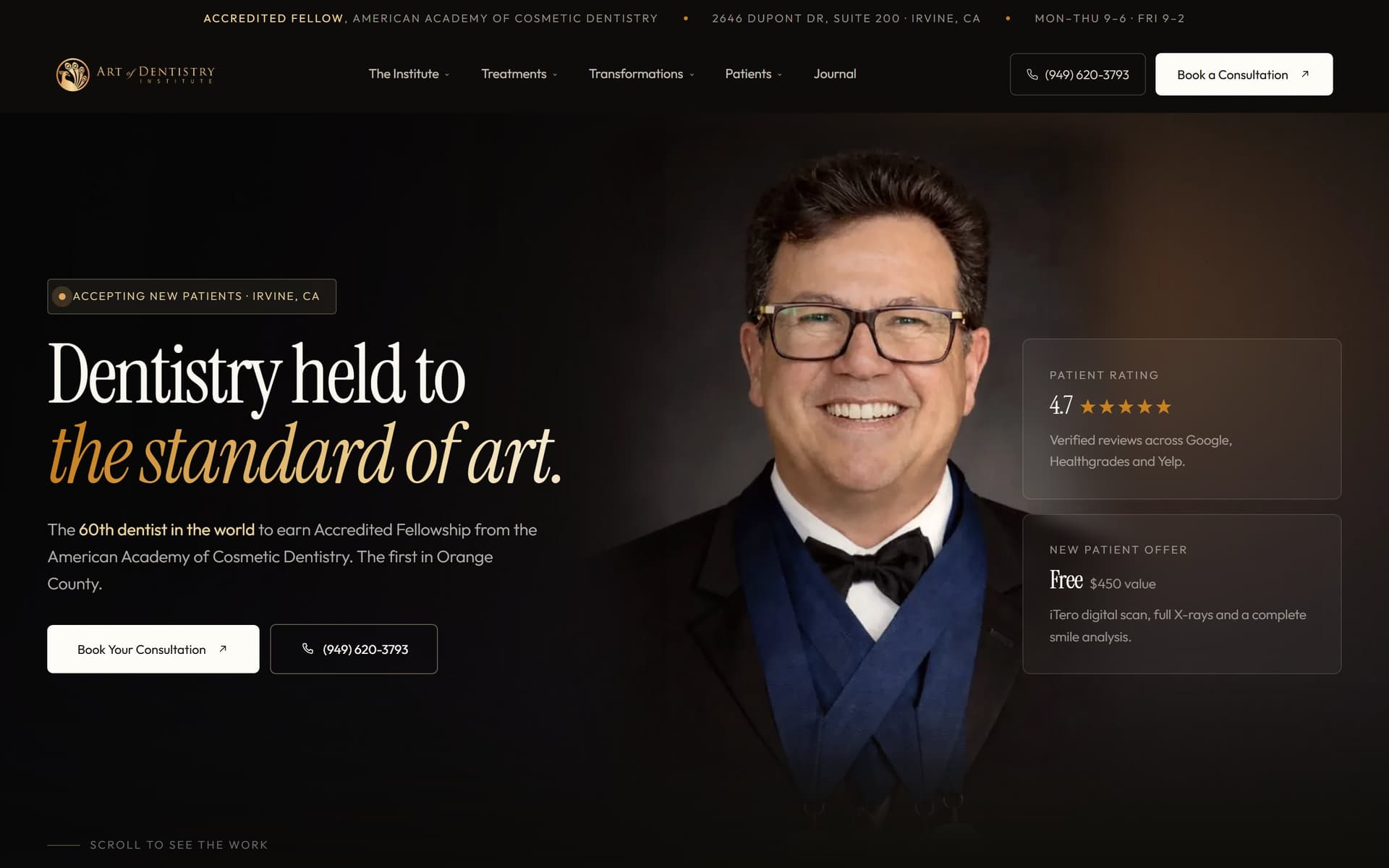
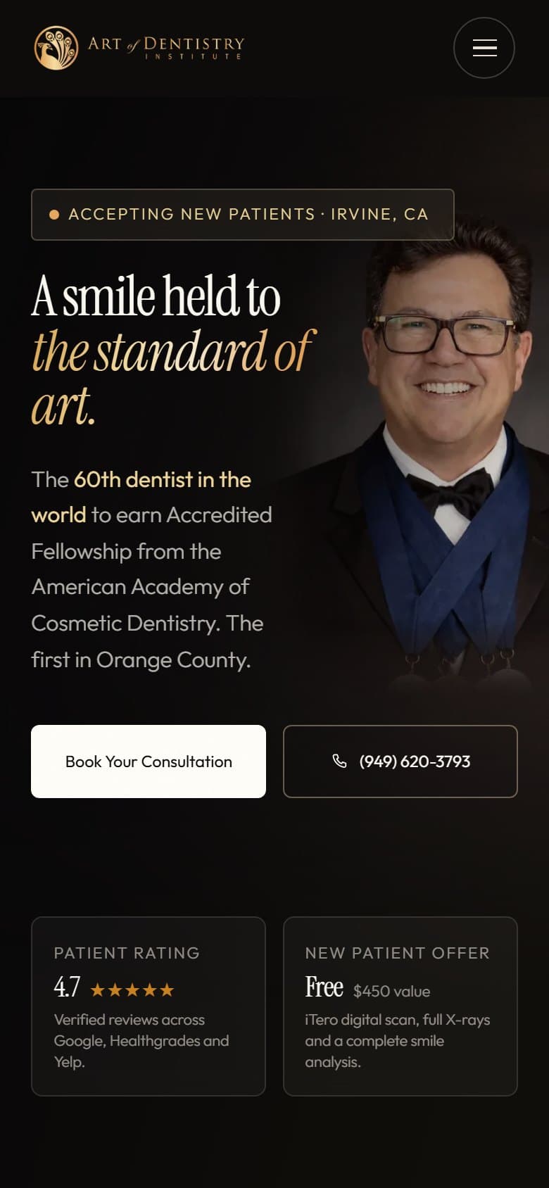
The credential does the other half of the work. This practice holds an Accredited Fellowship from the American Academy of Cosmetic Dentistry, which is rare enough to be worth stating in the first screen rather than filed under an About page. So the hero carries the claim and the face, and the scroll goes straight into the cases.
The design
Dark, warm and gold rather than the clinical blue every competing practice uses, because the room a cosmetic consultation happens in is closer to a gallery than a surgery and the palette should say so before the copy does.
A high-contrast serif with italics carries the turn in each heading, set large. Case photography runs full width with nothing competing beside it, because a before-and-after shrunk into a card stops being evidence.
The build
Static HTML and CSS with no build step and no framework, with the animation library vendored so the site works offline. Responsive down to real phone widths rather than a narrowed desktop window, since a patient comparing smiles is almost always doing it on a phone.
WHAT IT DEMONSTRATES
Leading with the one credential that separates a practice from its competitors, and building a page around photographic evidence instead of around a conventional service list.
THE EVIDENCE
- 70
- 100
- 100
WHAT I’D CHANGE
Accessibility and best practices both measure 100, and across three runs the only failing audits anywhere were the two SEO ones. `is-crawlable` fails because the preview is deliberately noindexed so a spec build cannot outrank the practice it was made for. `robots-txt` fails because there is no robots file at all, which is a real miss rather than a deliberate one and is a two-line fix. Mobile performance sits at 70 and swings as low as 46 between runs; the cost is the scroll-animation library, which has to parse and execute before the main thread frees up. Cutting it on phones would move that number most, and it is a design decision rather than a bug fix.
Independent project — designed and built by me