CASE STUDY
The practice people reach after someone else said no.
- Client type
- Implant and cosmetic dentistry, single practice
- Scope
- Homepage redesign · Content structure · Responsive build
- Year
- 2026
- Status
- Live — kurpisdentistry.thecreativezohaib.com
The situation
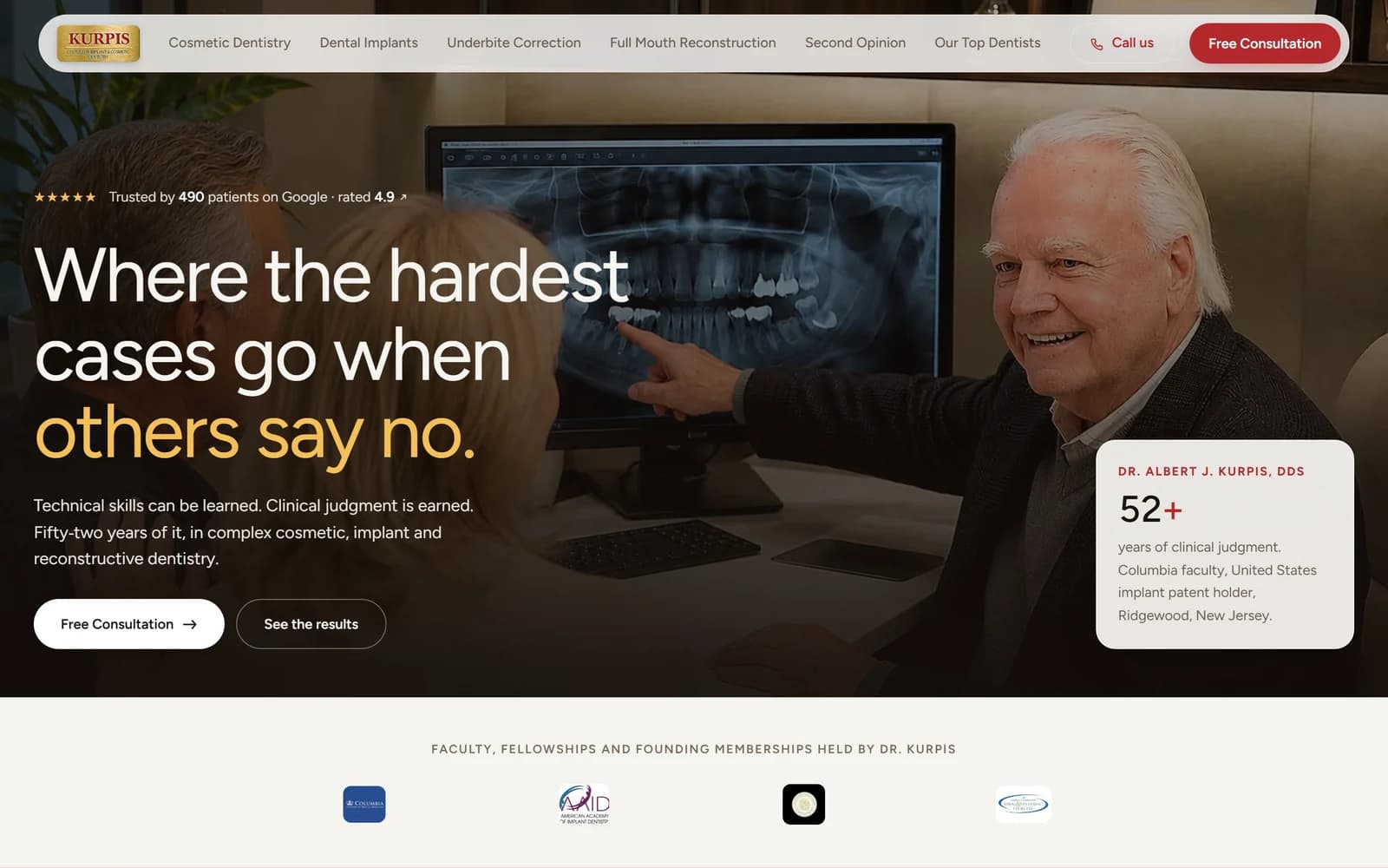
Most dental sites sell the same four things in the same order: the building, the equipment, the staff photograph, the offer. That works for a practice competing on convenience. It is the wrong argument entirely for one whose patients arrive having already been turned down somewhere else, often told they need jaw surgery or that teeth cannot be saved.
The thinking
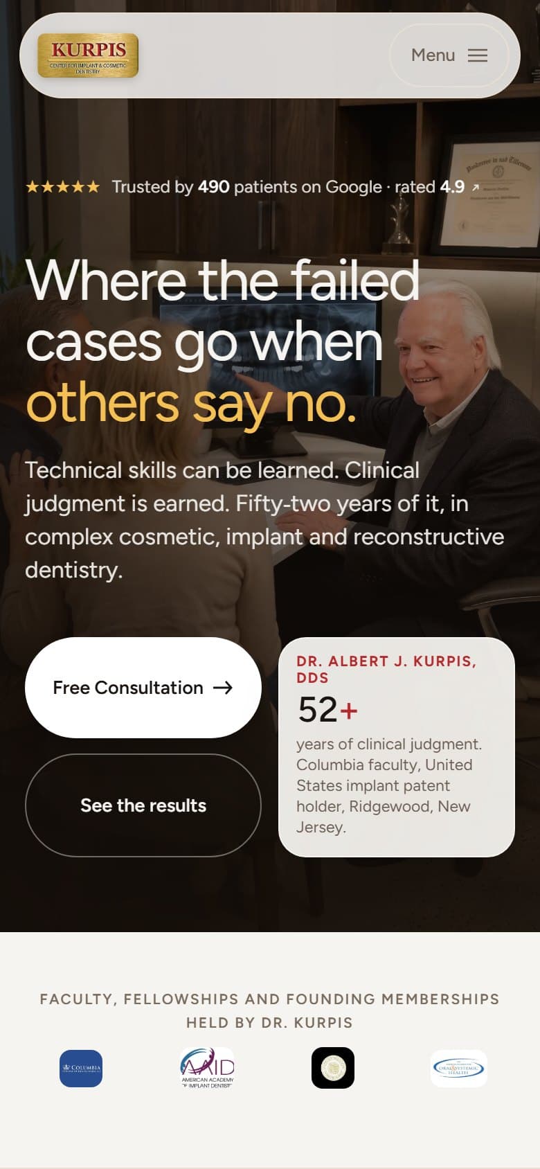
Someone in that position is not comparing opening hours. They are asking one question — is this the person who can do what the last one could not — and every section either answers it or wastes their time.
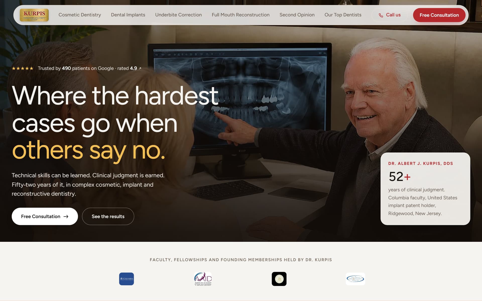
So the page leads with the refusal rather than the welcome. The headline names the situation the visitor is actually in, and the credentials directly under it are the specific ones that bear on the question: the years, the faculty position, the implant patent. Nothing is claimed that is not in the research brief for the practice.
The design
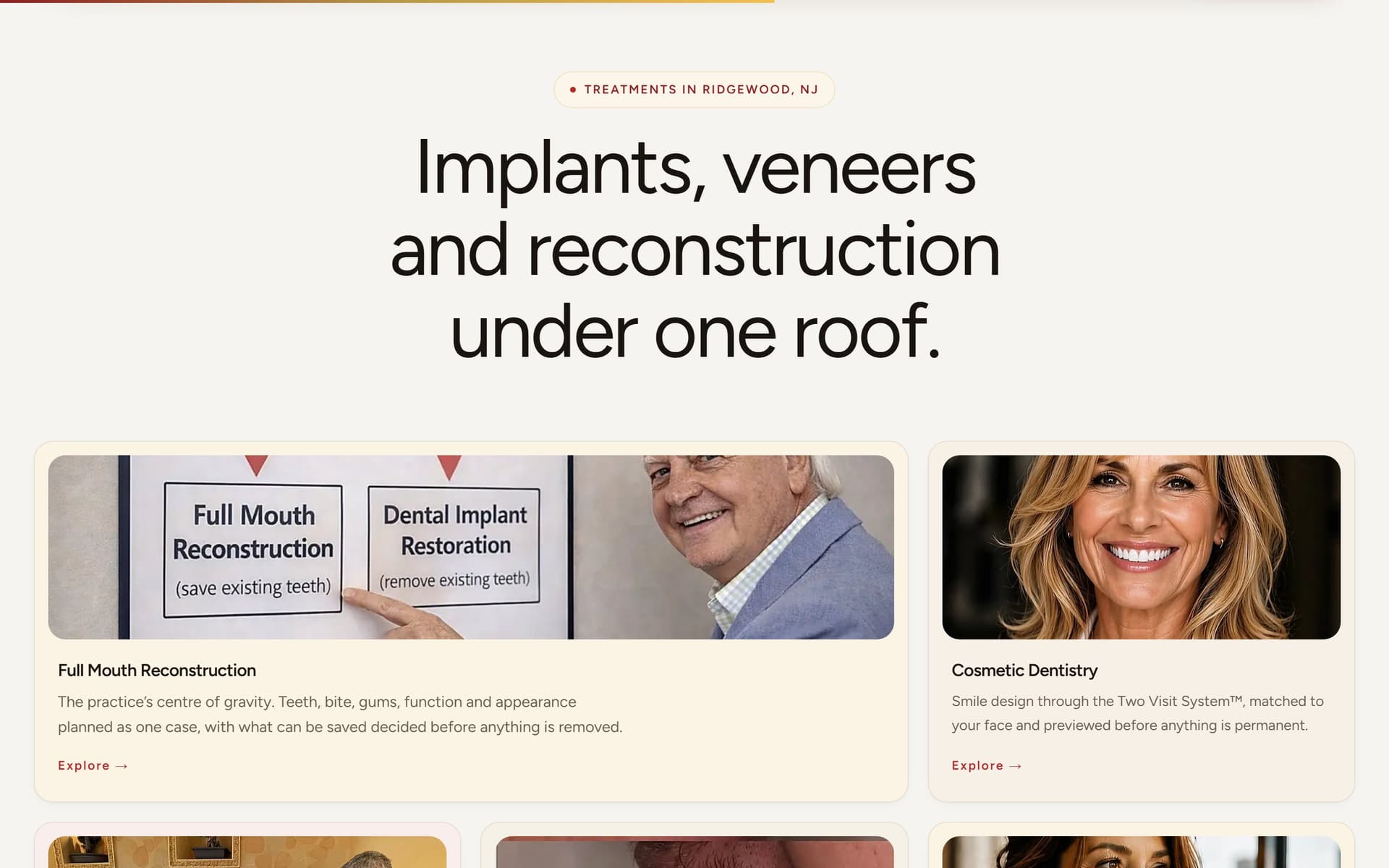
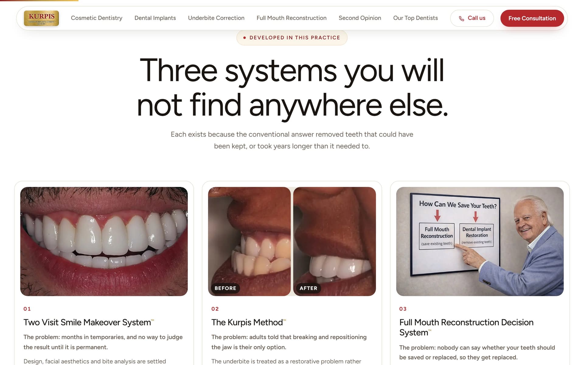
Warm off-white and oxblood taken from the practice’s own brass-and-crimson sign, rather than the blue-and-white every competitor in the county already uses. Photography does the reassuring: the dentist at the screen with a patient, the actual X-rays, real before-and-afters rather than stock smiles.
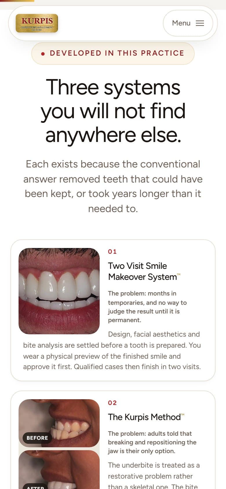
The three named treatment systems are given a section of their own, each opening with the problem it exists to solve, because a proprietary name means nothing until the reader knows what went wrong without it.
The build
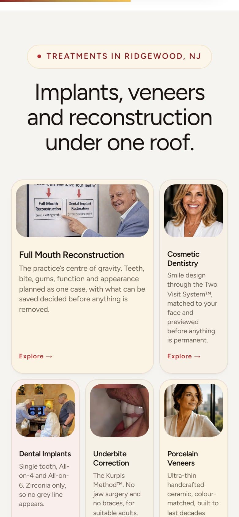
A single long homepage rather than a spread of thin service pages, with the treatment detail reachable from it. Static HTML and CSS, no framework and no build step, with the type as one self-hosted variable font file.
Images are WebP sized to twice their largest rendered box, and scroll motion is used only where it carries the sequence of a case rather than as decoration.
WHAT IT DEMONSTRATES
Finding the one question a high-anxiety patient is actually asking and ordering a homepage around it, carrying a specialist’s credentials without a wall of prose, and getting it all out of a static build with no framework.
THE EVIDENCE
- 100
- 100
WHAT I’D CHANGE
Measuring this one found four defects I had missed, and the numbers above are after fixing them. The document shipped with no doctype and no `<html>` element, so every browser was laying it out in quirks mode; there was no `<main>`, so a screen reader had no skip target; the dimmed words in the premise section sat at 2.85:1 against their background, under the 4.5:1 minimum, until the scroll animation lit them; and there was no robots file. Accessibility went 92 to 100 and best practices 92 to 100. Mobile performance is the honest weak point and still swings between roughly 54 and 88 across runs, because 113KB of scroll-animation library has to parse and execute before the main thread is free — total blocking time dropped from 1,550ms to around 210ms once the document shell was fixed, but the library is still the cost. Cutting it on phones, where the choreography buys least, is the change I would make next; it is a design decision, not a bug fix, so it is not one I would make unilaterally.
Independent project — designed and built by me